
Raised Ink Business Cards Are Still Alive in 2025 (Here’s Why They Win Attention)
Tired of your business cards getting lost in a sea of taps and swipes? A simple, raised ink business card still stops the scroll in real life. When someone feels that lifted print under their fingers, they look twice. They remember you.
Raised print business cards, also called thermography, use a method where powder is heated over wet ink to create a touchable, 3D finish. This adds depth and shine without the high tooling cost of engraving. In 2025, it matters because touch stands out, the premium feel elevates the look, and it pairs beautifully with rich color printing.
This guide covers how it works, why it still performs, practical design tips that get results, and how to order with confidence.
What are raised ink business cards and how do they work?
Thermography printing is simple. Your text or logo is printed with ink, a clear resin powder is added while the ink is wet, and heat fuses the powder to the ink. The result is a clear raised finish that you can feel.
Compared to flat printing, raised ink adds dimension. Type looks crisp, edges catch light, and key details pop. You get a premium feel without the higher cost or setup of engraving.
Thermography made simple: the 3D ink you can feel
- Ink is printed on the card.
- A clear powder is dusted over the wet areas.
- Heat melts the powder into the ink.
- The ink cures with a tactile finish and subtle gloss finish.
This 3D effect draws eyes to names and logos. Modern shops can mix raised ink with full color designs, so your style is not limited. Use color photos or gradients, then lift only the parts that matter.
Raised business cards vs embossing, foil, and spot UV
Here is a quick comparison to help you choose:
FinishWhat it doesProsConsBest use casesRaised ink (thermography)Raises printed ink with heat and powderBudget friendly, tactile, shinyVery fine lines can fill inNames, logos, short taglinesEmbossingRaises the paper itselfDeep texture, elegant feelRequires a die, higher setupMonograms, simple marks, luxury brandsFoilAdds metallic or pigmented foilHigh shine, premium impactSetup cost, best for solid shapesMetallic logos, borders, accentsSpot UVAdds clear glossy coating in select areasGloss contrast, can feel slightly raisedNeeds precise setup on coated stocksGlossy highlights over matte designs
Pick raised ink business cards when you want a tactile lift, solid readability, and lower setup cost than embossing, foil, or spot UV.
Best paper types and colors for bold raised details
- Choose medium to heavy stocks for a sturdy feel. Thicker paper protects raised edges.
- Uncoated or matte papers give classy contrast. Coated stocks make the raised ink shine more.
- Use high-contrast colors for names and headlines. Dark ink on light paper, or light ink on dark paper, reads fast.
- Avoid overloading tiny text with raised ink. Very small sizes can lose clarity.
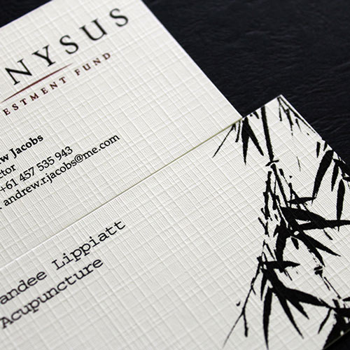
If you want texture plus lift, consider white linen material. See options like Linen business cards with raised ink options to combine tactile paper with tactile print.
Why raised business cards are still winning in 2025
Trends in 2025 favor textured finishes, bold dark cards, and sustainable papers. Raised ink fits right in. Touch grabs attention, signals quality, and helps people remember your name after the meeting.
Business owners value real-world performance of business cards. A raised ink business card helps you look professional, adds a hint of prestige, and makes the exchange quick and reliable. When Wi-Fi drops or phone batteries die, a card still works.
The power of touch: texture boosts recall
A tactile finish creates a small sensory moment. When someone rubs their thumb over a lifted logo, the brain tags that detail as important. That small pause can build trust and make your brand stick.
Use raised ink to lift one element that matters most. For example, raise your logo so it becomes a tactile marker, or raise your job title so clients remember why you are the person to call.
Modern print trends you can use now
- Rich dark cards with strong contrast for text.
- Clean layouts with space to breathe.
- Eco friendly paper choices with a premium feel.
Raised ink works well with Full Color Printing. Full color raised ink business cards let you run bold branding across the card, then raise just one or two elements for impact. Keep restraint. Premium design is simple, clear, and easy to scan. Trends also include alternatives like Soft Touch finish for a modern edge.
Where raised ink makes the biggest impact
- Client-facing pros: sales, consultants, coaches.
- Luxury services and boutique shops.
- Real estate, finance, and legal.
- Creative studios and event networking.
These roles depend on a strong first impression. Raise your name, company, or a short tagline. Guide the eye to the most important detail and make it easy to remember.
Common myths that hold buyers back
- “Raised ink is outdated.” Not true. The look is classic, and the gloss finish feels current.
- “It only works for one-color designs.” Modern presses mix raised ink with full-color art every day.
- “It always costs a lot more.” It usually sits between flat printing and heavy processes like letterpress or deep embossing.
Design tips to make your raised ink business card stand out
Keep your business cards simple, bold, and readable. Use raised ink as a highlight, not as wallpaper. Your goal is to help the other person grasp your info in two seconds.
What to raise: logo, name, headline, or call to action
Raise only one or two design elements:
- Logo for brand memory.
- Full name or company name for quick recall.
- Short tagline or a tight call to action like Book a demo.
Limited use keeps the card clean and premium. It also guides attention where you want it.
Readable typography and color contrast
- Pick clean, simple fonts. Sans serif or readable serif.
- Use enough size and weight so the raised lettering effect stays crisp.
- Favor strong contrast for full color raised ink business cards. If the background is dark, use light type.
- Skip ultra-thin scripts or tiny text. They can blur or fill in.
- Match your full color designs so the card feels consistent with your site and proposals.
Keep it clean: spacing, margins, and file setup
- White space helps the raised areas breathe and shine.
- Keep important raised elements away from edges, respecting standard card size, to avoid chipping.
- Use vector logos for sharp edges. Save print files using CMYK Full Color Printing.
- Set images at 300 dpi. Label or note the elements to be raised.
- If timing allows, order a printed proof to check clarity and color.
Avoid overdoing it: balance and brand fit
Use raised ink as a highlight. One focal point is enough. Make sure the finish suits your brand voice, whether refined for legal or bold for creative work. Test two versions with colleagues or trusted clients and see which one they remember the next day.
Cost, durability, and how to order with confidence
Raised ink adds value without a big jump in budget. It is durable for normal use when printed on quality stock. A simple checklist helps avoid delays and reprints.
Pricing expectations and value vs flat cards
Raised business cards usually cost a bit more than standard flat business cards, but less than letterpress, Raised Spot Gloss Business Cards, or embossed gloss business cards. The value comes from a stronger first impression, a memorable feel, and a premium look among high quality products. Many owners find the small increase pays back in meetings and referrals.
Longevity and care: how raised ink holds up
Raised ink is made to last for everyday use. For best results:
- Store cards in a sturdy holder.
- Avoid sharp friction inside bags or pockets with keys.
- Keep cards dry and clean.
- Choose thicker paper stock to protect edges and preserve the lift.
Print-ready checklist: files, proofing, and timelines
Use this quick list to speed approval and reduce mistakes in the printing process:
- Vector logo file for crisp edges.
- CMYK color setup, 300 dpi images.
- Clear notes or layers marking raised elements.
- Safe margins and proper bleed for standard size.
- Artwork proof approval before the full run.
- Consider options like rounded corners for custom business cards.
- If unsure, order a small batch first and check legibility in hand.
Typical turnaround ranges from a few business days to a week or two, depending on stock, finish, and proofing. Plan ahead for conferences, launches, and key meetings.
Conclusion
Raised print business cards are very much alive in 2025 because touch, clarity, and premium style still work. The clear raised finish guides attention with lift, adds polish with shine, and the feel helps people remember you. Pick one or two elements to raise, keep the layout simple, choose a sturdy stock, and order a proof. Bring a few to your next meeting, then watch reactions when someone feels that Raised Spot Gloss Business Cards detail.
Leave a Comment